Electronifie
Brand and Website
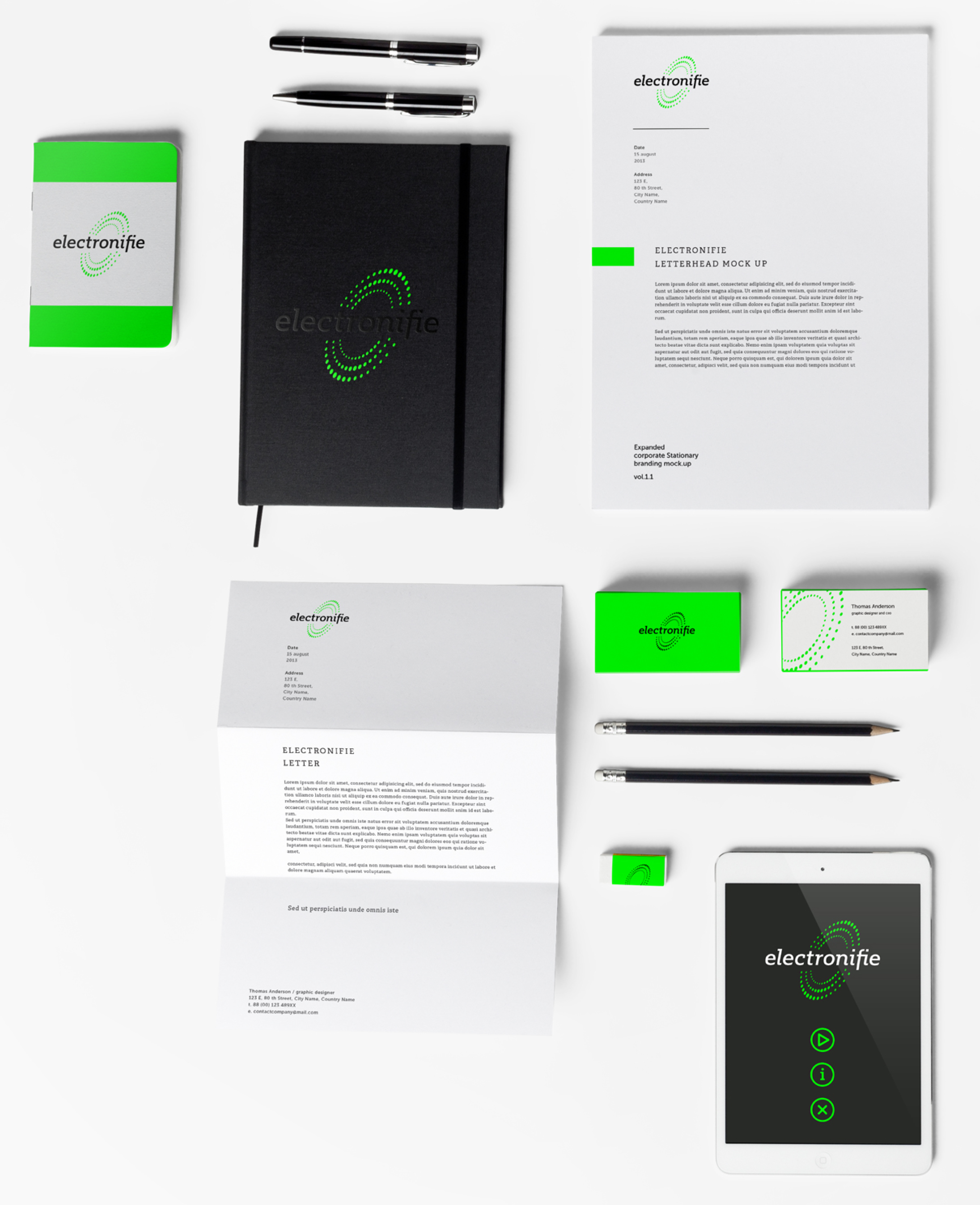
Electronifie is revolutionizing the corporate bond market with their new technology and they needed a brand to reflect that. It had to be modern while at the same time paying homage to the old-school technology era. We all had fond memories of our black-screened CRT monitors with bright green text, so we thought that color space would be a great place to start when beginning the branding journey.
Logo

We dove deep into what was at the core of Electronifie— the swarming nature of the peer-to-peer corporate bond market. With this in mind we came up with a concept of many dots swirling around a single point. That single point became the “o” in “electronifie” symbolizing how Electronifie is the center of this totally new marketplace.
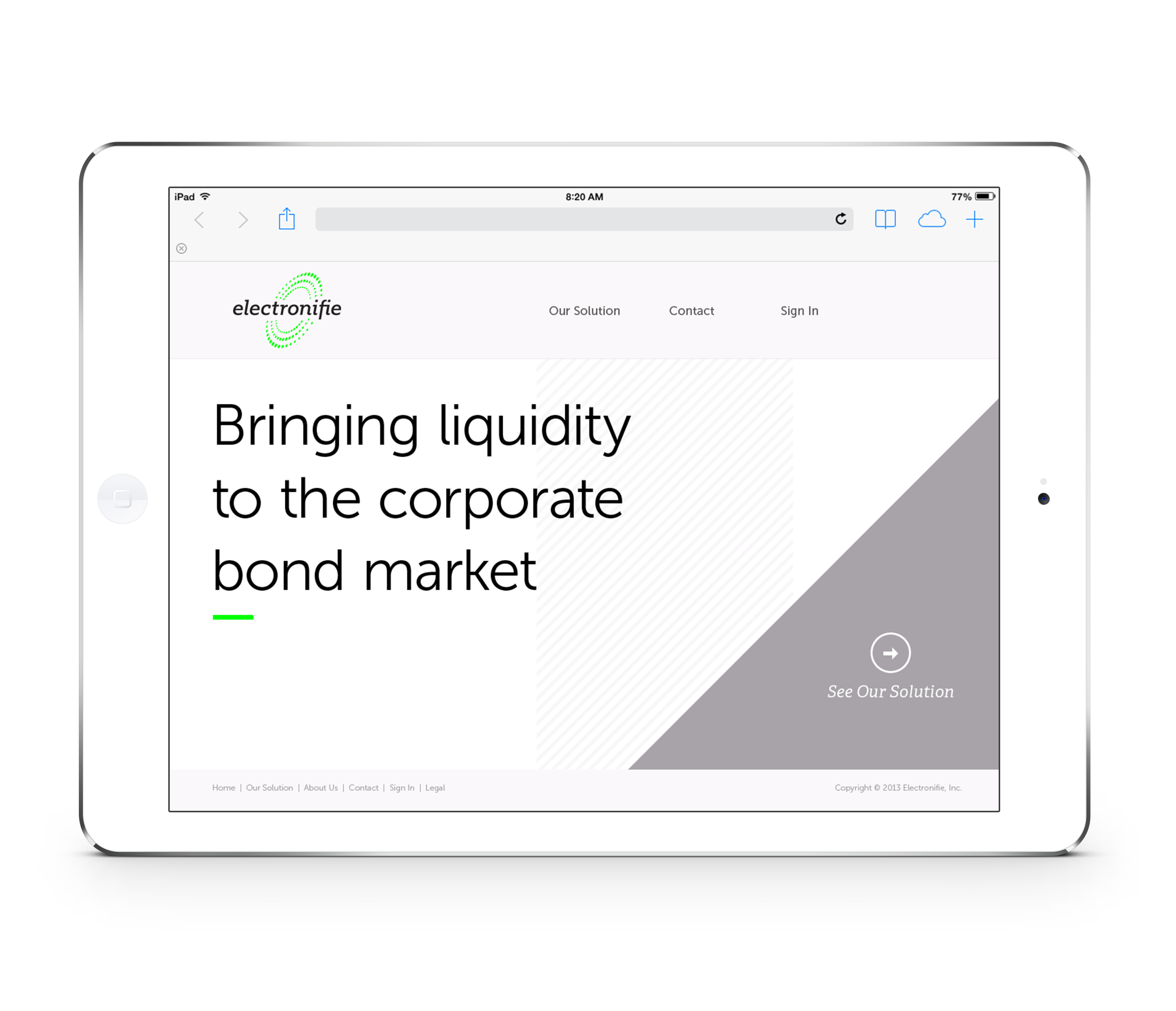
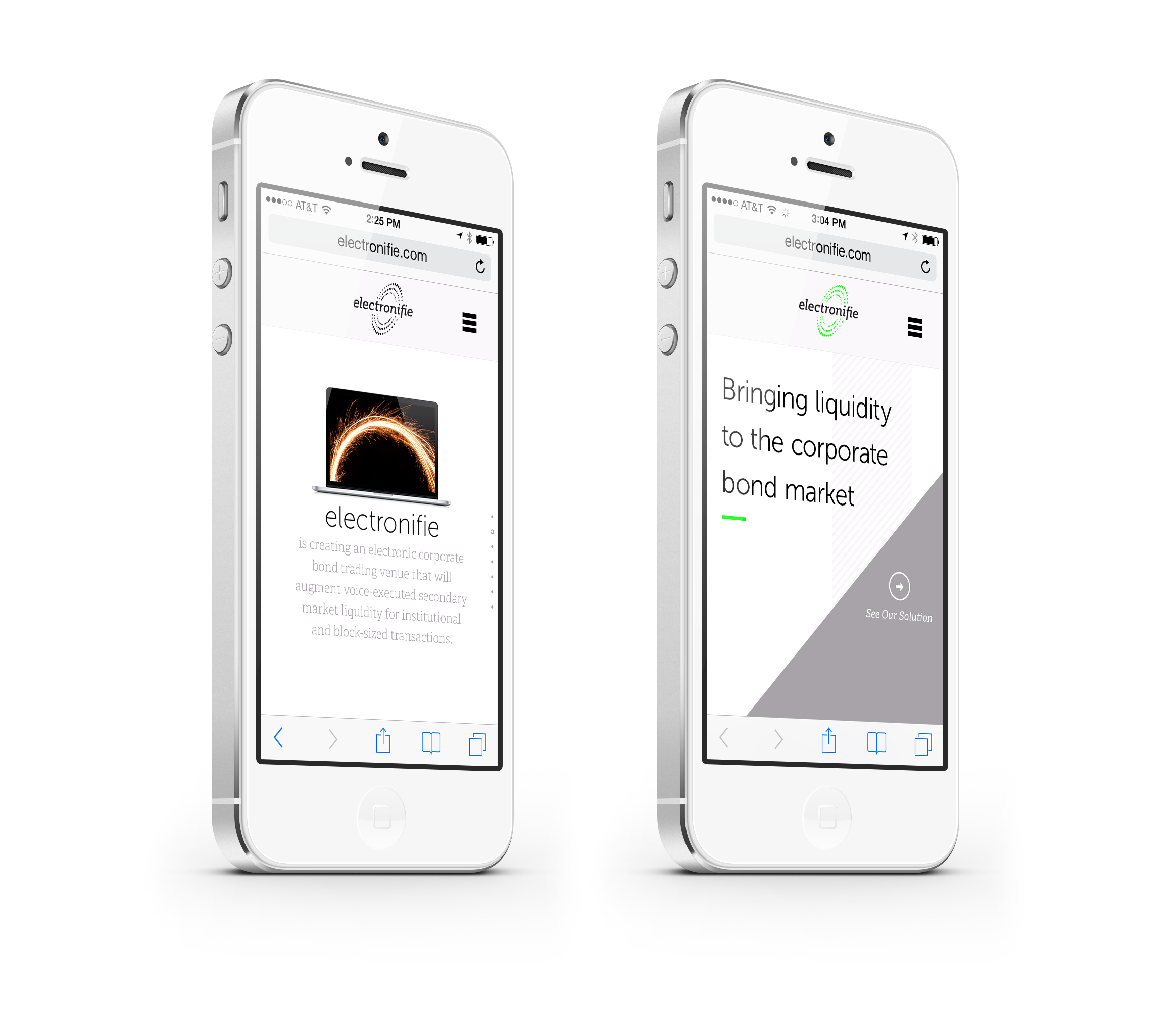
Web Presence
Once the brand identity was established, we began thinking about their website and how to carry this branding, along with their message, to the web. We held to the same styling that inspired the logo while bringing in hand-drawn graphics to help explain
how Electronifie works in a friendly and simple way. We also used simple, clean, and highly stylized animations to help communicate some of the more complex aspects of the product.
Sketches for Web Content