Betr
Betr (formerly Pure Proactive Health) is changing
the standard approach to weight loss by providing lifestyle modification as a service. By focusing on healthy living rather than quick fixes, Betr has helped thousands of clients lose weight, reduce medications, eliminate stress, and feel more like themselves.
Creative Strategy
Stop dieting. Start healing. That’s the mission of Pure Proactive Health. They openly expressed the need for a new name—one that spoke to the heart of the company. We spent time focusing on a Creative Strategy tailored to their priorities: defining creative needs, establishing a timeline with discernible milestones, creating a plan, and taking inventory all of their moving parts. By stepping outside of the day- to-day, you allow yourself to see what’s ahead—and get to experience that 30,000- foot view.
Challenge
Pure Proactive needed a new name that spoke to its mission— and an identity created to reflect that.
Solution
We spent time in concept, thinking of new names that resonated with the client’s “heal your body” mission. We landed on “Betr” and began building out a brand based on persona development we focused on first. Copywriting played a key role in developing the brand, defining the voice and tone.
Results
Pure Proactive transformed into Betr. With their new brand, website, and content, they can accurately target their personas, know how to best talk with them, and appeal to them not only in what they provide but also how they look doing it.
Brand
Pure Proactive Health wanted to redefine themselves, and during the Creative Strategy, we knew the best way to achieve this was through a new brand—a brand that clearly spoke to health, nutrition, overall wellness, and, most importantly, resonated with their current clients—so Betr was born.

After meeting with their team to learn more about their customers, we defined their core personas, which guided all future content creation. Once we had this piece of marketing communication, we could design the Visual Identity of their brand in a way that effortlessly communicated to Betr’s audience.
During this process, we went through dozens of iterations, finally landing on a concept that was clean, crisp, and worked for both the full wordmark and the logo mark—that worked perfectly in both print and digital.


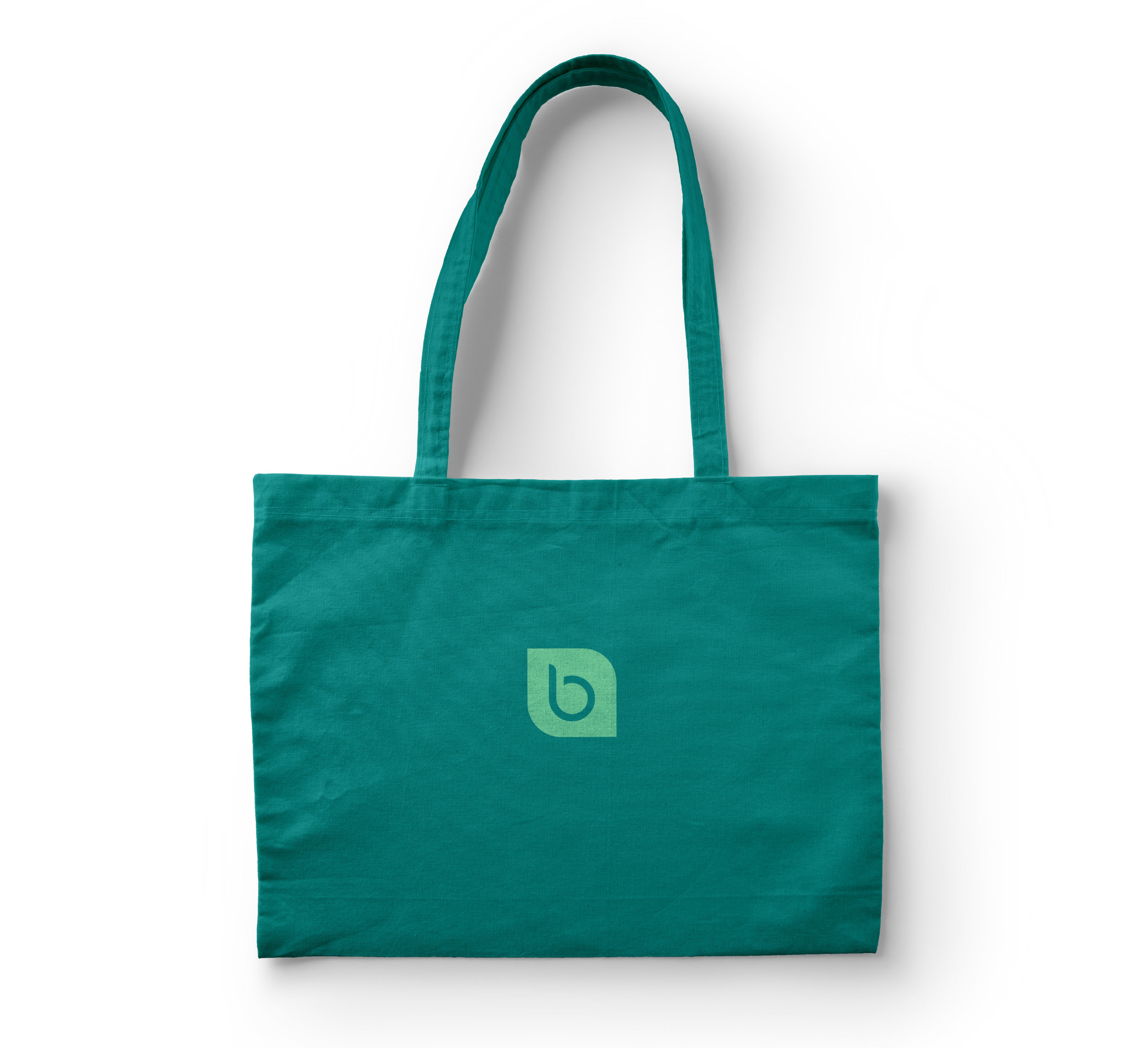

Adena’s decisions are purposeful. They bridge the gap between the art and science of design, as seen in Betr’s chosen brand colors: two colors that spoke to health and life with bright blue and green tones.
When assembling Typography Guidelines, we wanted to give Betr a blend of bold headlines, readability, and authenticity. We chose a bold, yet simple typeface to convey headlines. For body copy, we selected a clean and highly readable font. Lastly, we determined their accent font reminiscent of handwriting, which allows Betr to add a personal feel when sharing reviews from real clients.


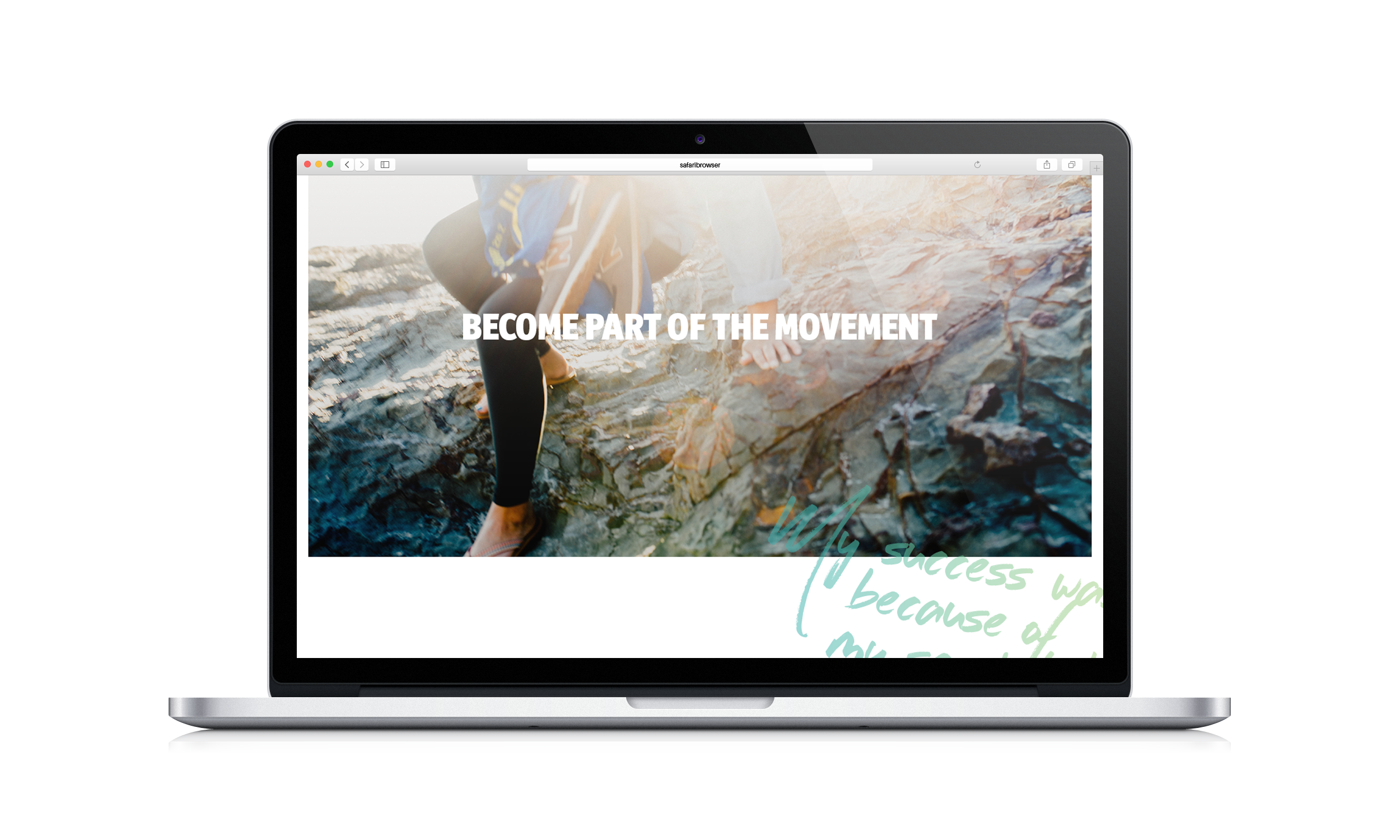
Social Media Content
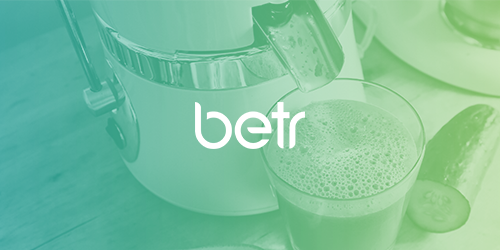
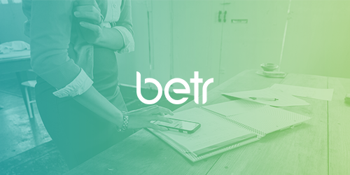
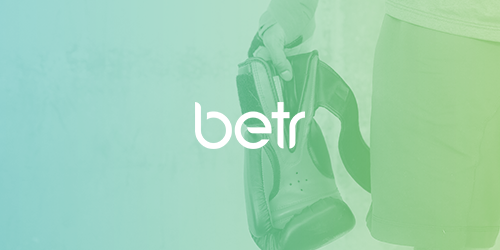
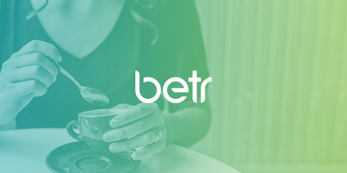
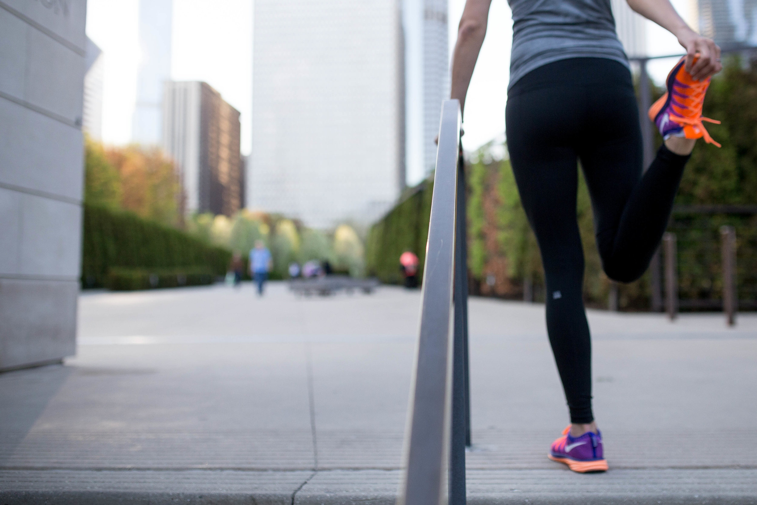
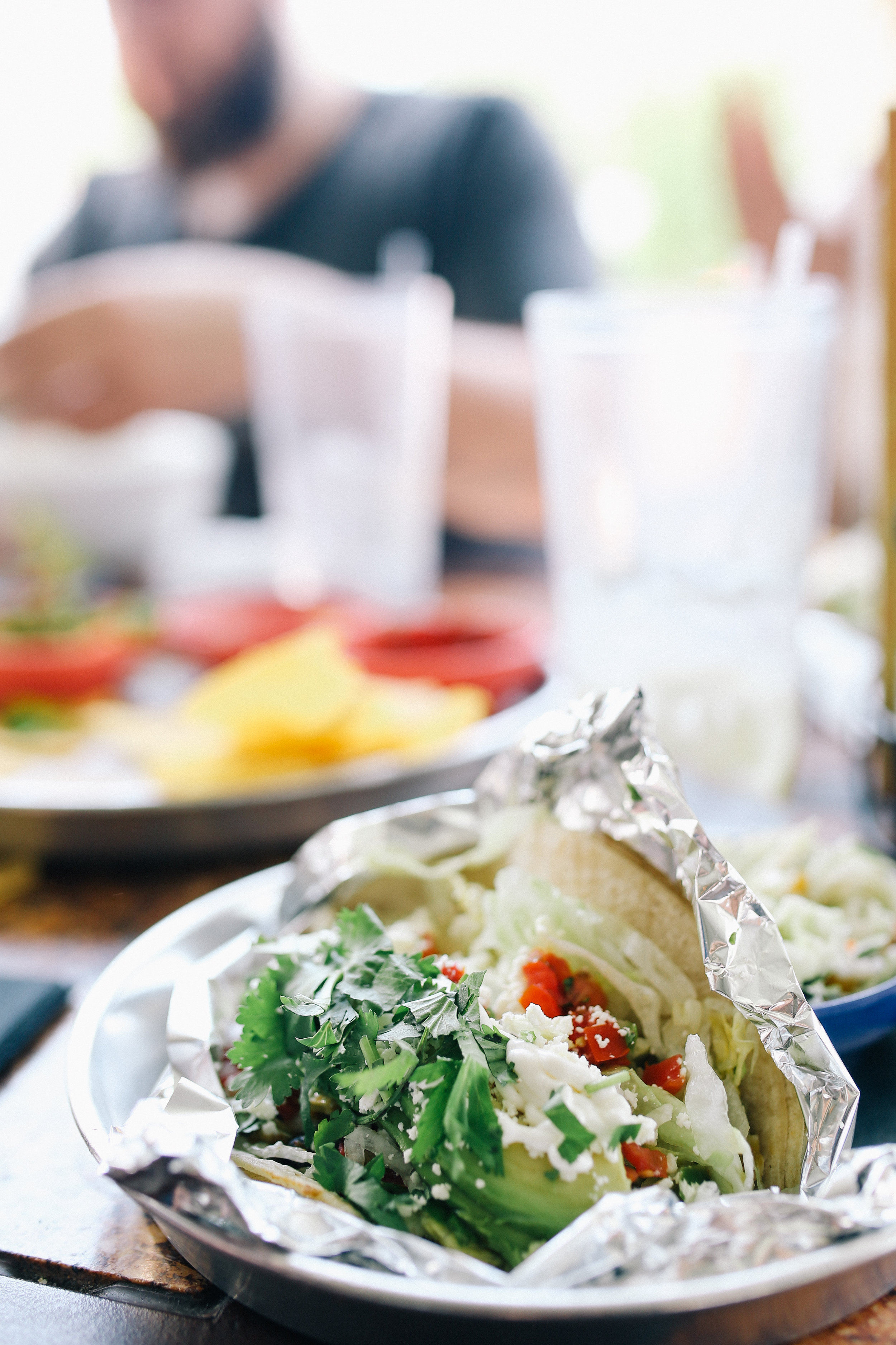
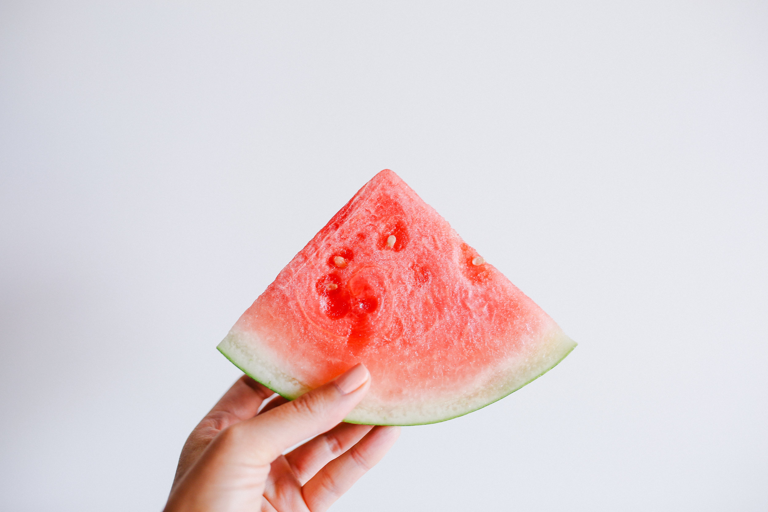
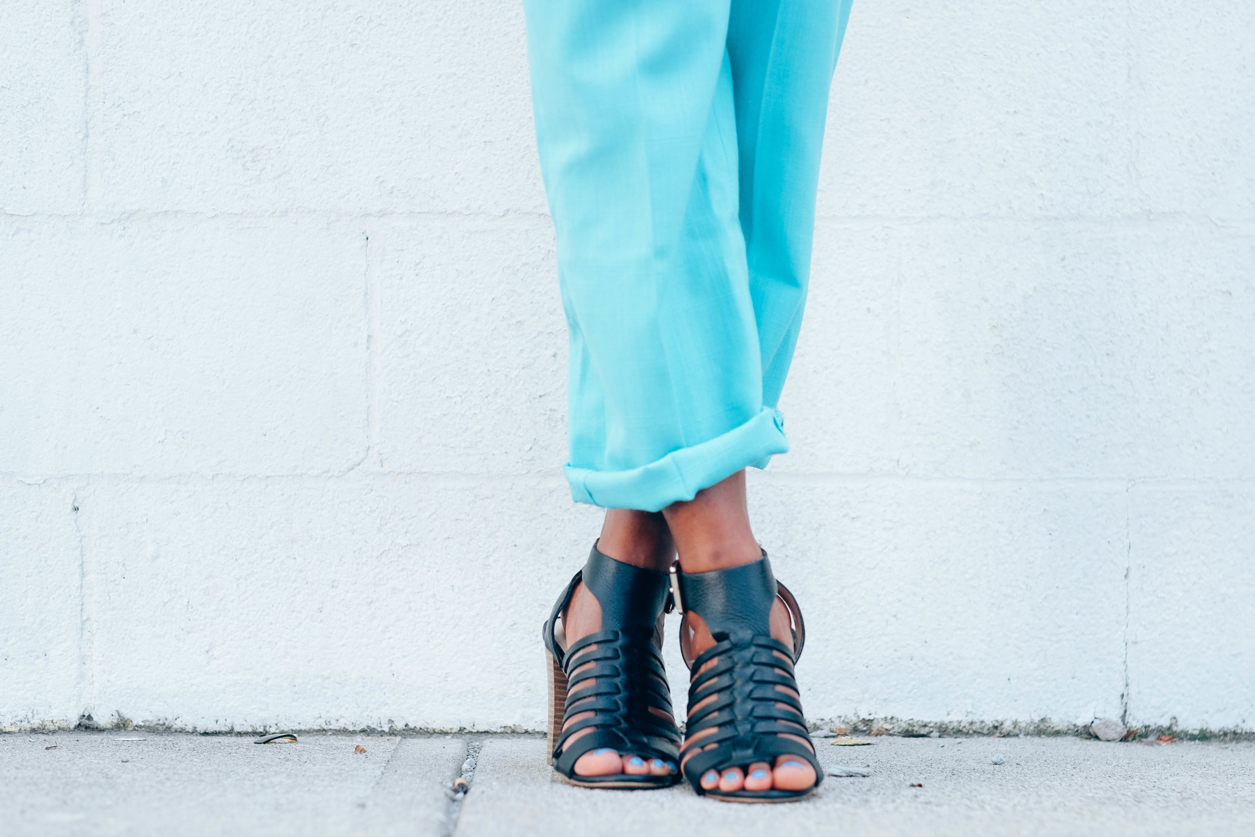
In creating Social Media content for Betr, we used several principles fleshed out in the brand, such as never focusing on the face of a subject, sticking to inspirational imagery, and intentionally showing normal, healthy people participating in physical activity that wasn’t overly intense or exerting. It was important not to alienate potential clientele in any way. The social media plan did not focus on the preparation of food, to show clients that Betr’s program was something that was easily going to fit into their daily routines. Every piece of content produced embodied clear intentionality.
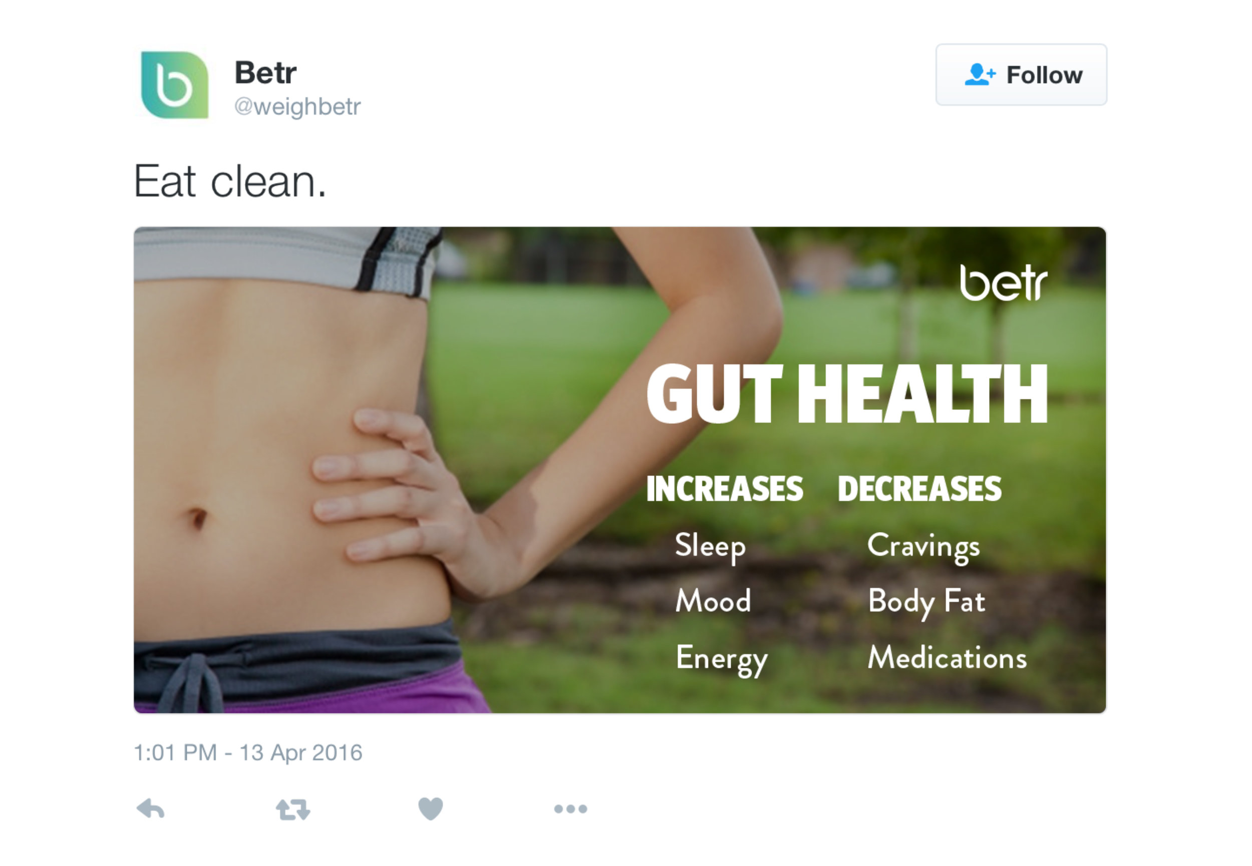

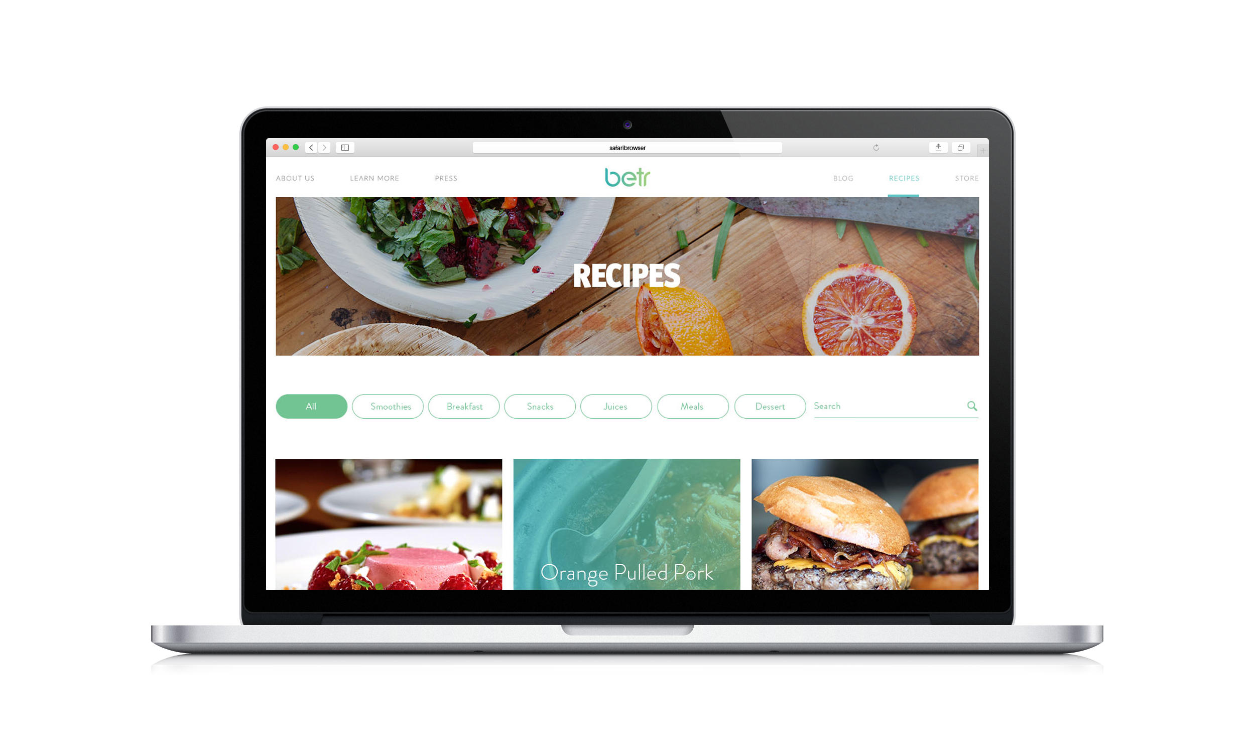
Marketing Collateral
When developing partnerships, Betr came to us to create marketing collateral for them to use not only in the pursuit of new business but also to support those partners once they began working together. Above all, it was important to clearly message the core of Betr to different audiences in a way that had obvious appeal and, above all, was distinctly convincing and captivating.